What's new

Big Blue & bright colors from the 70s

Intentionally Blank

Scientology Widow
Speaking as someone who spent his childhood in them and bought a house 15 years ago that was built during them, the 1970s were an aesthetic wasteland in the US. Avocado appliances. Orange / brown / yellow mottled shag carpets long enough to choke a vacuum cleaner which, when combined with the lime green wallpaper with yellow and white flowers looks like a camouflage pattern for an invasion of Las Vegas.

And the clothes. Great googly moogly, the clothes.

I'm not sure how much acid most of you Boomers were dropping in the 70s, but by looking at your interior decorating choices, it seems to have been a metric fuck ton. And you're wondering why Big Blue had a fucked up color scheme when you toss Laffy in the middle of that?


:dieslaughing::dieslaughing::dieslaughing::dieslaughing::dieslaughing::dieslaughing::dieslaughing::dieslaughing::dieslaughing::dieslaughing::roflmao::roflmao::roflmao::roflmao::roflmao::roflmao::roflmao::roflmao::hysterical::hysterical::hysterical::hysterical::hysterical:
 

HelluvaHoax!

Platinum Meritorious Sponsor with bells on
...

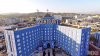
QUESTION: WTF was Ron thinking when he had the complex painted ugly blue.

ANSWER: He was thinking this. . . .


religion_today.jpg


EXPLANATION: When Ron saw blue he thought of the ocean. And Ron loved the ocean. So, naturally Ron assumed that everyone else wanted to look at blue buildings because they are the same as the ocean. And so people would be happy. It's Scientology--it doesn't have to make sense.
 
Last edited:

Gib

Crusader
There is a story going around to the effect that someone who is or was senior management staff said, the original light blue for the exterior of the Cedars Complex and/or those bright primary colors and super-graphics for the inside of the PAC Orgs circa 1977 - 1982 were a big mistake and the result of a single "druggie ex-staffer".

Is this just a Scientology urban legend? What is the source of this story?

Respectfully,

The Original Big Blue

Tags: Scientology, Dianetics, COS, PAC (Pacific Area Command), CESO (Cedars Estates Service Organization), EPF (Estates Project Force), RPF (Rehabilitation Project Force), FOLO (Flag Operations Liaison Office), LAO (Los Angeles Organization), ASHO (American Saint Hill Organization), AOLA (Advanced Organization Los Angeles), CMO (Commodore's Messenger Organization), Lebanon Hall, paint.

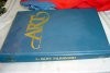
There is The Art book, copyright 1991, by Bridge Publications that states on page 105 Color Associations:

" According to marketing research, there is a whole index of emotional response to colors. For example, blue is usually associated with knowledge or serenity; yellow is mostly associated with value and red prompts impulse buying. "

click on the pictures below. I'm not saying this is true, I'm just posting what the book says.
 

Attachments

  • c1.jpg
    c1.jpg
    63.1 KB · Views: 21
  • c2.jpg
    c2.jpg
    40.3 KB · Views: 16

TheOriginalBigBlue

Gold Meritorious Patron
Yep! It was Ceders of Lebonon in 1974.. Imagine my surprise when I started reading about Scietology, years ago, and realized they bought the hospital with the name on my birth certificate.. Small world. My family was never associated with Scientology directly..I just knew a few as a child growing up..but I was born there when it was still a hospital.

Wow, that was only 2 years before the church bought it. I didn't realize it was still being used that long. Read the history. It was quite a place. It was built like a tank because they knew of the earthquake risk but this is its last go round. After the COS or another big quake it will be leveled. If you want pictures for posterity don't wait too long.
 

TheOriginalBigBlue

Gold Meritorious Patron
There is The Art book, copyright 1991, by Bridge Publications that states on page 105 Color Associations:


click on the pictures below. I'm not saying this is true, I'm just posting what the book says.

Very interesting contribution. It references the usage for film so maybe this evolved out of the work LRH and DM were doing at Gold which coincided with the color design for the Complex.
 

TheOriginalBigBlue

Gold Meritorious Patron
...

QUESTION: WTF was Ron thinking when he had the had the complex painted ugly blue.

ANSWER: He was thinking this. . . .


religion_today.jpg


EXPLANATION: When Ron saw blue he thought of the ocean. And Ron loved the ocean. So, naturally Ron assumed that everyone else wanted to look at blue buildings because they are the same as the ocean. And so people would be happy. It's Scientology--it doesn't have to make sense.

You make a good case for the exterior color aspect of this thread.
 

TheOriginalBigBlue

Gold Meritorious Patron
well, go to tony ortega blog, and note the pictures of DM on stage with a blue background:

http://tonyortega.org/2015/04/09/re...the-father-of-scientologys-leader/#more-21725

I checked out your picture. Blue is clearly integral to the long standing general SO color theme as evidenced by uniforms and decor, etc. However, just to be fair, if you pay attention to a lot of back lighting for TV newsrooms and sophisticated productions like Miami CSI you will see a similar usage of blue, especially with complimentary orange, etc. It really works well on-screen and in later years LRH was very much into that kind of thing. So this all does seem to support a possible bias towards the approval of blue by LRH even if he initially didn't specifically order that blue be used.
 

Smurf

Gold Meritorious SP
Wow, that was only 2 years before the church bought it. I didn't realize it was still being used that long. Read the history. It was quite a place. It was built like a tank because they knew of the earthquake risk but this is its last go round. After the COS or another big quake it will be leveled. If you want pictures for posterity don't wait too long.

It was rated as one of L.A.'s "10 ugliest buildings".. http://www.timeout.com/los-angeles/attractions/the-10-ugliest-buildings-in-los-angeles

"HOLLYWOOD: Crack historian/commenter Vokoban has dug up a 1930 LA Times article on the completion of the Cedars of Lebanon Hospital on Fountain Ave.--the property that would eventually become the Church of Scientology's West Coast headquarters. The LAT wrote then: "It has a capacity of 250 beds and cost approximately $1,500,000 to erect. Some idea of its massiveness may be gained from the fact that the materials used for the concrete work, furnished by Consolidated Rock Products Company, amounted to 8900 tons of rock and 6800 tons of washed sand." CoL merged with Mount Sinai Hospitals in 1961 to became Cedars-Sinai.":

http://la.curbed.com/archives/2011/...was_big_and_blue_chris_browns_parking_tix.php
 

Gib

Crusader
I checked out your picture. Blue is clearly integral to the long standing general SO color theme as evidenced by uniforms and decor, etc. However, just to be fair, if you pay attention to a lot of back lighting for TV newsrooms and sophisticated productions like Miami CSI you will see a similar usage of blue, especially with complimentary orange, etc. It really works well on-screen and in later years LRH was very much into that kind of thing. So this all does seem to support a possible bias towards the approval of blue by LRH even if he initially didn't specifically order that blue be used.

Hubbard used everything and anything,

to persuade.

It's called the "cheese" to make folks get on the bandwagon known as being a "scientologist", somebody who supposedly "knows". But all they "know" in the end is Hubbardology. LOL
 

dchoiceisalwaysrs

Gold Meritorious Patron
Here I had thought that blue was chosen to represent what Tubs was actually doing. So the paint selection team had it exactly on Source, and matched the "Let's Sell These People a Piece of Blue Sky" theme that Jon Atak later stole from Tubs for the title of his book. :biggrin:

That damned Jon, always so on Source...LOL
 

TheOriginalBigBlue

Gold Meritorious Patron
It was rated as one of L.A.'s "10 ugliest buildings".. http://www.timeout.com/los-angeles/attractions/the-10-ugliest-buildings-in-los-angeles

"HOLLYWOOD: Crack historian/commenter Vokoban has dug up a 1930 LA Times article on the completion of the Cedars of Lebanon Hospital on Fountain Ave.--the property that would eventually become the Church of Scientology's West Coast headquarters. The LAT wrote then: "It has a capacity of 250 beds and cost approximately $1,500,000 to erect. Some idea of its massiveness may be gained from the fact that the materials used for the concrete work, furnished by Consolidated Rock Products Company, amounted to 8900 tons of rock and 6800 tons of washed sand." CoL merged with Mount Sinai Hospitals in 1961 to became Cedars-Sinai.":

http://la.curbed.com/archives/2011/...was_big_and_blue_chris_browns_parking_tix.php

Thank you for both of these very pertinent articles. The first article appears to answer the public survey question. On the second historical story, one thing that can be said in favor of the paint, is that it did serve to provide a little protection for the original design work during the building's reprieve from its inevitable destiny with a controlled demolition expert.
 

F.Bullbait

Oh, a wise guy,eh?
It can probably be assumed he was receiving adequate reports and photographs but do you know that he inspected for a fact?

From the sets and costumes used in early Gold photo shoots I think your "sense of aesthetics" comment has merit.

Yup, LRH showed up at least once. ASHO was done and AO was being renovated. He pitched a fit in the usual manner. The renovation was going too slowly. Capt. Bill was brought in and EPFers were worked until they dropped from lack of sleep.
 

eldritch cuckoo

brainslugged reptilian
Fascinating thread, as I'm interested in colors and pigments, and especially in blue pigments and dyes - and their history.
Long story short, human beings were obsessed with acquiring blue paint and fabric dye during the whole history. Blue still is the favorite color of around 40% of all people, around the world.

In my opinion, the color of this building was intended to match or symbolize "sky blue".
This would also match the general Co$ "sky blue / laser blue" promotion color, but I don't know whether that color scheme was implemented before or after the paint for this building was chosen. Or probably HelluvaHoax is right, and for Hubs it was merely a reference to the blue of the ocean (and the citie's name).

In any case, look at a front shot of the building, with its dominant "wings", and it almost seems to merge with the blue sky (given that the sky is not clouded, or darkening). It is an eerie feeling. I suppose this was intentional, even if Hubs hasn't imagined (or experienced) standing in front of the wings and looking up. Especially for a believer, it makes the building appear more powerful, more meaningful. It is a sinister effect.

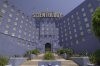
Look at the often used front shot provided to news outlets for articles about "Going Clear". As the color hues ("H" of "HSL") of building and sky match each other so exactly in that shot, and more than in any other photo I could find, I suppose it was shooped. Otherwise this would be a great coincidence, not only depending on the time of day and the weather but also on the specifics of the camera used, etc. This would be another clever move of the film makers, as it makes the building appear even more eerie and "dominant" (amplifying just what the original intention of Hubbard probably was with that color choice).


I don't know about other countries, but here pastel blue - "sky blue" or "baby blue" - is, together with other pastel colors, a relatively normal color to paint one's house. (Although the city has to be asked for approval to "fit the style of the street/city" ("Ortsbild"), so you can't paint your house, small or large, just in any crazy color.)
Although in the case of the "Big Blue", the blue seems to be darker than usually when a building is painted in any version of what is commonly known as a happy "sky blue" or "baby blue".

And to be honest, I'd paint a house of mine just that color, or even darker (if the city lets me). :blush: If they would let me, I'd probably smear the walls with low-binder Ultramarine paint until they glow, even if it doesn't keep long, hehe. It's not long ago that I found out the trick to apply Ultramarine that way (even without the help of Mr. I'm-A-Smartass Klein), and I'm definitely going to do that in my next apartment to parts of the walls! :biggrin:


After studying all these shots of the "Big Blue", I'm still insecure which pigment was used in that case because the differences between cameras and screens and the possibility of some postprocessing (contrast adaption etc) make it impossible to be certain of what it really looks, whereas, if looking at a paint(ing) "live", I'm often able to determine the pigment(s). However, on these shots sometimes the paint looks violet (blue that tends towards red), sometimes cyan/turquoise (blue that tends towards green). Could people who have seen the building, help me here?

Any chance to find out via old documents whether the pigment here is Phtalocyanide, Prussian blue, Ultramarine, or even Cobalt blue? Or a mixture of these?


attachment.php


attachment.php
 

Attachments

  • CBTo3EkW8AANBY1 (400).jpg
    CBTo3EkW8AANBY1 (400).jpg
    21.2 KB · Views: 114
  • goingclear_1200_article_story_large (400).jpg
    goingclear_1200_article_story_large (400).jpg
    19.1 KB · Views: 114

Boson Wog Stark

Patron Meritorious
I was going to post my new, improved Big Blue Blues GIF, with sign falling down, but the GIF is too large to post here.:grouch:

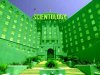
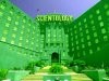
Anyway, I'm sorry I didn't save the images but about a year ago when the subject of Big Blue came on Tony's blog, I experimented with coloring photos of Big Blue in various colors. The original color, a yellowish brick probably looks better than blue, but it is pretty ugly too. However, green is a lot more hideous than blue.

The blue matching the sky gives it an imposing, endless look, but it reminds me of a state hospital, even though it was just a regular hospital when it was built.

I think of it as kind of a like a big, blue angel of death with wings extended enclosing SCIENTOLOGY. The size of the sign, combined with the architecture and color, give it an outdated and overblown presence which is fitting of Scientology.

Here's a quick version of Big Green:
BG1_zpss4bdtkjv.jpg
 

Attachments

  • BG1_zps71jg3xlj.jpg
    BG1_zps71jg3xlj.jpg
    53.6 KB · Views: 22

HelluvaHoax!

Platinum Meritorious Sponsor with bells on
..

I was going to post my new, improved Big Blue Blues GIF, with sign falling down, but the GIF is too large to post here.:grouch:

Anyway, I'm sorry I didn't save the images but about a year ago when the subject of Big Blue came on Tony's blog, I experimented with coloring photos of Big Blue in various colors. The original color, a yellowish brick probably looks better than blue, but it is pretty ugly too. However, green is a lot more hideous than blue.

The blue matching the sky gives it an imposing, endless look, but it reminds me of a state hospital, even though it was just a regular hospital when it was built.

I think of it as kind of a like a big, blue angel of death with wings extended enclosing SCIENTOLOGY. The size of the sign, combined with the architecture and color, give it an outdated and overblown presence which is fitting of Scientology.

Here's a quick version of Big Green:


:hysterical:

Green seems quite appropriate!

Reminds me of something. . .

"We're off to see the Wizard

Emerald_City_61745.jpg


"The wonderful Wizard of Cauz"
 

F.Bullbait

Oh, a wise guy,eh?
I never saw Cedars turned blue (just as well). Probably LRH thought a blue monolith would turn on some incident that would compell the rubes to fork over their savings.
 
Top