Fascinating thread, as I'm interested in colors and pigments, and especially in blue pigments and dyes - and their history.
Long story short, human beings were obsessed with acquiring blue paint and fabric dye during the whole history. Blue still is the favorite color of around 40% of all people, around the world.
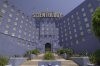
In my opinion, the color of this building was intended to match or symbolize "sky blue".
This would also match the general Co$ "sky blue / laser blue" promotion color, but I don't know whether that color scheme was implemented before or after the paint for this building was chosen. Or probably HelluvaHoax is right, and for Hubs it was merely a reference to the blue of the ocean (and the citie's name).
In any case, look at a front shot of the building, with its dominant "wings", and it almost seems to merge with the blue sky (given that the sky is not clouded, or darkening). It is an eerie feeling. I suppose this was intentional, even if Hubs hasn't imagined (or experienced) standing in front of the wings and looking up. Especially for a believer, it makes the building appear more powerful, more meaningful. It is a sinister effect.
Look at the often used front shot provided to news outlets for articles about "Going Clear". As the color hues ("H" of "HSL") of building and sky match each other so exactly in that shot, and more than in any other photo I could find, I suppose it was shooped. Otherwise this would be a great coincidence, not only depending on the time of day and the weather but also on the specifics of the camera used, etc. This would be another clever move of the film makers, as it makes the building appear even more eerie and "dominant" (amplifying just what the original intention of Hubbard probably was with that color choice).
I don't know about other countries, but here pastel blue - "sky blue" or "baby blue" - is, together with other pastel colors, a relatively normal color to paint one's house. (Although the city has to be asked for approval to "fit the style of the street/city" ("Ortsbild"), so you can't paint your house, small or large, just in any crazy color.)
Although in the case of the "Big Blue", the blue seems to be d
arker than usually when a building is painted in any version of what is commonly known as a happy "sky blue" or "baby blue".
And to be honest, I'd paint a house of mine just that color, or even darker (if the city lets me).

If they would let me, I'd probably smear the walls with low-binder Ultramarine paint until they glow, even if it doesn't keep long, hehe. It's not long ago that I found out the trick to apply Ultramarine that way (even without the help of Mr. I'm-A-Smartass Klein), and I'm definitely going to do that in my next apartment to parts of the walls!

After studying all these shots of the "Big Blue", I'm still insecure which pigment was used in that case because the differences between cameras and screens and the possibility of some postprocessing (contrast adaption etc) make it impossible to be certain of what it really looks, whereas, if looking at a paint(ing) "live", I'm often able to determine the pigment(s). However, on these shots sometimes the paint looks violet (blue that tends towards red), sometimes cyan/turquoise (blue that tends towards green). Could people who have seen the building, help me here?
Any chance to find out via old documents whether the pigment here is Phtalocyanide, Prussian blue, Ultramarine, or even Cobalt blue? Or a mixture of these?